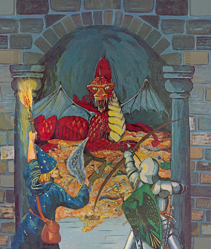
So D&D's almost 50 years old. That's half a century of gaming goodness, and I'm sure Hasbro's gonna commemorate this to the hilt when the time comes. But with so much history behind it, I sometimes think about its imagery (and its many changes) and what artwork is emblematic of the game. Something universal despite its seemingly endless remakings; basically, a single image that stands for all it was and will ever be. I pick the cover of Holmes Basic. Here's a look. After some (much) debate, it's the quintessential image:
The game's called Dungeons & Dragons. Here's a dungeon; and a dragon; and a pair of adventurers ready for battle. Nothing comes closer than this to depicting, and I mean literally translating, a name to an image. But it also nails the essential experience of the game by showing its actors, action, and setting. And its creator must have understood this...
Sutherland was a great artist. Not because he was slick like Easely, but because he was simultaneously accomplished with a rough-around-the-edges amateur spirit. This fine artist was relieved by WotC when it aspired to more modern production, and he was right to feel abandoned by the industry he helped bring to visible life. But he gets the last laugh because his work is emblematic where other, more polished efforts fade away.
Gaming is at its very best a peer-to-peer exercise. The later stuff sometimes feels top-down, which is why Sutherland was so effective. I don't mean to denigrate the obvious talent of modern artists. I couldn't draw my way out a paper bag, so those who can get my undying admiration and respect. But artists from the hobby's amateur age also deserve credit. Minus the photorealistic depictions of orcs in sophisticated city adventures, it's that much easier to grasp the hobby's central truth: fighting dragons and winning gold in dark dungeons...


"Top-down" is a good way to describe most later gaming art. "Corporate" is another. I'm not looking for perfection or imperfection. I'm looking for something with soul.
ReplyDeleteYou're right! This image has soul...
DeleteSomething engaging -- regardless of the skill level. You have to capture the imagination with one quarter-page black and white image.
DeleteThe original painting of this was on display until recently at the Norman Rockwell Museum in Massachusetts. The exhibit in which it appeared is called "Enchanted: A History of Fantasy Illustration." I saw it and enjoyed the exhibit greatly, including that painting. As your previous comment says, the painting does have soul, even in the midst of fancier professional art in the same exhibit.
ReplyDeleteThe same exhibit is now touring to selected museums, and it looks like the next stop is the Hunter Museum of American Art in Chattanooga, TN, May 20 to September 25. I assume that Sutherland's original will appear publicly in this venue, too.
https://www.huntermuseum.org/exhibition/enchanted-a-history-of-fantasy-illustration
Who knows where it will appear next? Maybe some of your readers will have a chance to see it in TN.
I live in TN, so I may have to check this out!
DeleteDave was my friend. In fact, I suggested he send some art samples to TSR.
ReplyDeleteBeing laid off from WOTC devistated him. Medical causes notwithstanding, he died of a broken heart.
He deserved better than what he got; but I hope he knew just how important he and his work was to so many people, myself included...
DeleteA poignant point about art with soul being somehow more inspiring than modern art. I see this problem in modern comics and overproduced modern RPGs. I've looked at several PDFs I have of the latest edition of the original game and other newer RPGs, and I was down with them very quickly because I was put off by the cartoony "photo"-realism of the art. It is obviously done by talented people (so I won't drop names - that would be cruel), but the simple inspirational images and soul seem to be absent... and do not compare to this Holmes cover.
ReplyDeleteI agree on all counts!
DeleteHear hear!
ReplyDelete