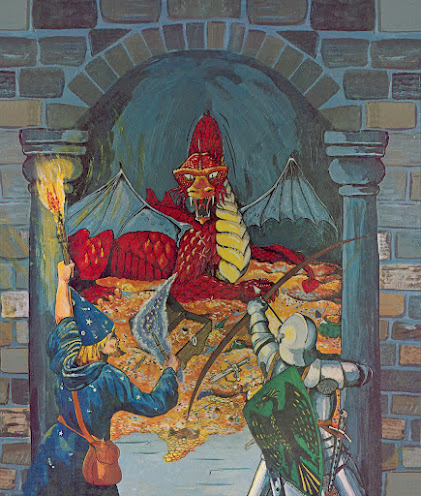
So D&D's almost 50 years old. That's half a century of gaming goodness, and I'm sure Hasbro's gonna commemorate this to the hilt when the time comes. But with so much history behind it, I sometimes think about its imagery (and its many changes) and what artwork is emblematic of the game. Something universal despite its seemingly endless remakings; basically, a single image that stands for all it was and will ever be. I pick the cover of Holmes Basic. Here's a look. After some (much) debate, it's the quintessential image:
The game's called Dungeons & Dragons. Here's a dungeon; and a dragon; and a pair of adventurers ready for battle. Nothing comes closer than this to depicting, and I mean literally translating, a name to an image. But it also nails the essential experience of the game by showing its actors, action, and setting. And its creator must have understood this...
Sutherland was a great artist. Not because he was slick like Easely, but because he was simultaneously accomplished with a rough-around-the-edges amateur spirit. This fine artist was relieved by WotC when it aspired to more modern production, and he was right to feel abandoned by the industry he helped bring to visible life. But he gets the last laugh because his work is emblematic where other, more polished efforts fade away.
Gaming is at its very best a peer-to-peer exercise. The later stuff sometimes feels top-down, which is why Sutherland was so effective. I don't mean to denigrate the obvious talent of modern artists. I couldn't draw my way out a paper bag, so those who can get my undying admiration and respect. But artists from the hobby's amateur age also deserve credit. Minus the photorealistic depictions of orcs in sophisticated city adventures, it's that much easier to grasp the hobby's central truth: fighting dragons and winning gold in dark dungeons...


